Project goal:
The main goal of this project is to recreate the interative version of Dr. John Snow's map with other supportive charts using D3 and javscript.
Tools used:
- Html
- CSS
- Javascript
- D3
- SVG
- Coolors.co
- Daltonize
Data:
As part of this project, the following data files were provided to begin the project.
- Streets.json - The streets data was given in json format, where the coordinates represent the line segments, so that the outbreak map sketch could be created.
- Pumps.csv - This file represent the coordinates of each pump on the map and it was formatted in csv with x and y coordinates.
- Deathdays.csv - This file helped in plotting the supported chart to present the number of deaths for each day of the outbreak.
- deaths_age_sex.csv - This file was used to plot the locations of each death on the outbreak map. It contains details about each victim, including their age-group, sex, and location.
Design process:
- Following the viewing of the data file, I created a basic initial sketch of my visualization dashboard along with the additional charts to demonstrate how I can interact with all the plots while visualizing any graph.
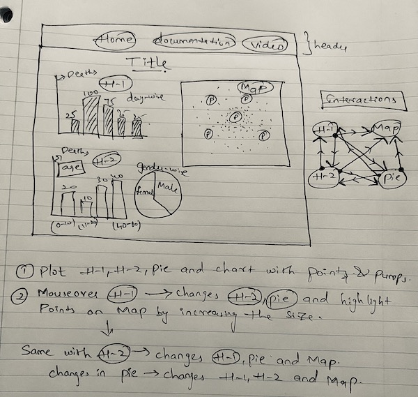
- Since I was given a variety of requirements, I initially started by plotting a graph to visualize the timeline graph using the Deathdays.csv file to determine which day had the most fatalities. To view this, I create a basic histogram graph as per the design.
- The streets.json and pumps.csv files were then used to plot the street paths and pumps, respectively.
- Later, I used the same histogram graph to view the death rate by age group using the deaths_age_sex.csv file. And, using the sex information I created a pie chart and x,y coordinates helped in plotting the datapoints on the map.
- Then I began incorporating the relationships between the various plots. I had to modify the ids of the map datapoints and use 3 classes with spaces to interact with additional plots because I had 3 additional charts to support the map. Additionally, the interactions between the additional plots couldn't be established.
Rationale of design choices:
- Charts selection - This visualization demonstrates a pie chart and two supporting bar plots. Since histograms are frequently used to examine trends over time, I decided to use one to symbolize the daily fatalities.
The agegroup was displayed using the same logic. I used a pie chart to show the distribution of male and female fatalities since gender was the category. - Color selection - For a series of colors, I chose a color pallete from coolors website and for the same I checked for color blindness using the Daltonize Chrome-plugin.
I used the same color for female and male on female and male datapoints, respectively, to represent the differences between the various datapoints on the map based on category. I initially tried using cool colors for this, but the white background of the map made it difficult to see the entire set of datapoints. I had to replace these colors with others that were contrasty and bright.
And, blue color was used to represent the water pumps.
Challenges:
- The plot interactions between the various changes were advanced iteratively.
- The datapoints were initially given unique ids, but in order for them to interact with the timeline plot-1, classes had to be added. To interact with the second histogram plot, I had to change this again, adding two classes in the process. Assuming the same would occur with the pie-chart interaction, I've also added the third class.
- However, because the second and third classes began with numbers, I had trouble with the interactions as I added them. The problem was solved by changing that.
- Again, there were no shared identifiers between the barplot-1 and the other additional charts I tried to interact with, so I didn't consider merging the data files once more. But I'd like to use it for my future work because of the lack of time.
Findings:
The 1854 pandemic and the COVID pandemic had a similar distribution. When timeline plot-1 is examined, the death distribution is extremely high during the mid-time point. Future trends may be comprehended when this distribution plot is taken into account. Additionally, it can be deduced that both children and the elderly are the most affected, which may be because they lack immunity. Other progressive illnesses and a person's life style could also contribute to old age mortality.
References:
(n.d.). Retrieved October 25, 2022, from https://www.carlosrendon.me/unfinished_d3_book/d3_attr.html
How to create a pie chart using D3. (n.d.). Retrieved October 25, 2022, from https://www.educative.io/answers/how-to-create-a-pie-chart-using-d3
D3 Layout Pie Chart. (n.d.). Retrieved October 25, 2022, from https://bl.ocks.org/jiankuang/a591ff3331044f8c9a59764a1424bb07
Mapping with D3 - maps.unomaha.community. (n.d.). Retrieved October 25, 2022, from https://maps.unomaha.community/Peterson/GEOG8670_Fall19/D3/Mapping_with_D3.pdf
Dev, J. (2019, January 30). Week 10b - intro to d3.js: Mapping data with D3. Retrieved October 25, 2022, from https://observablehq.com/@jdev42092/week-10b-intro-to-d3-js-mapping-data-with-d3